PIVOTTE 2.0
After acquiring initial customers, we went through several more evolutions of refining the product offering, branding & messaging as well as updating the retail website.
branding & messaging
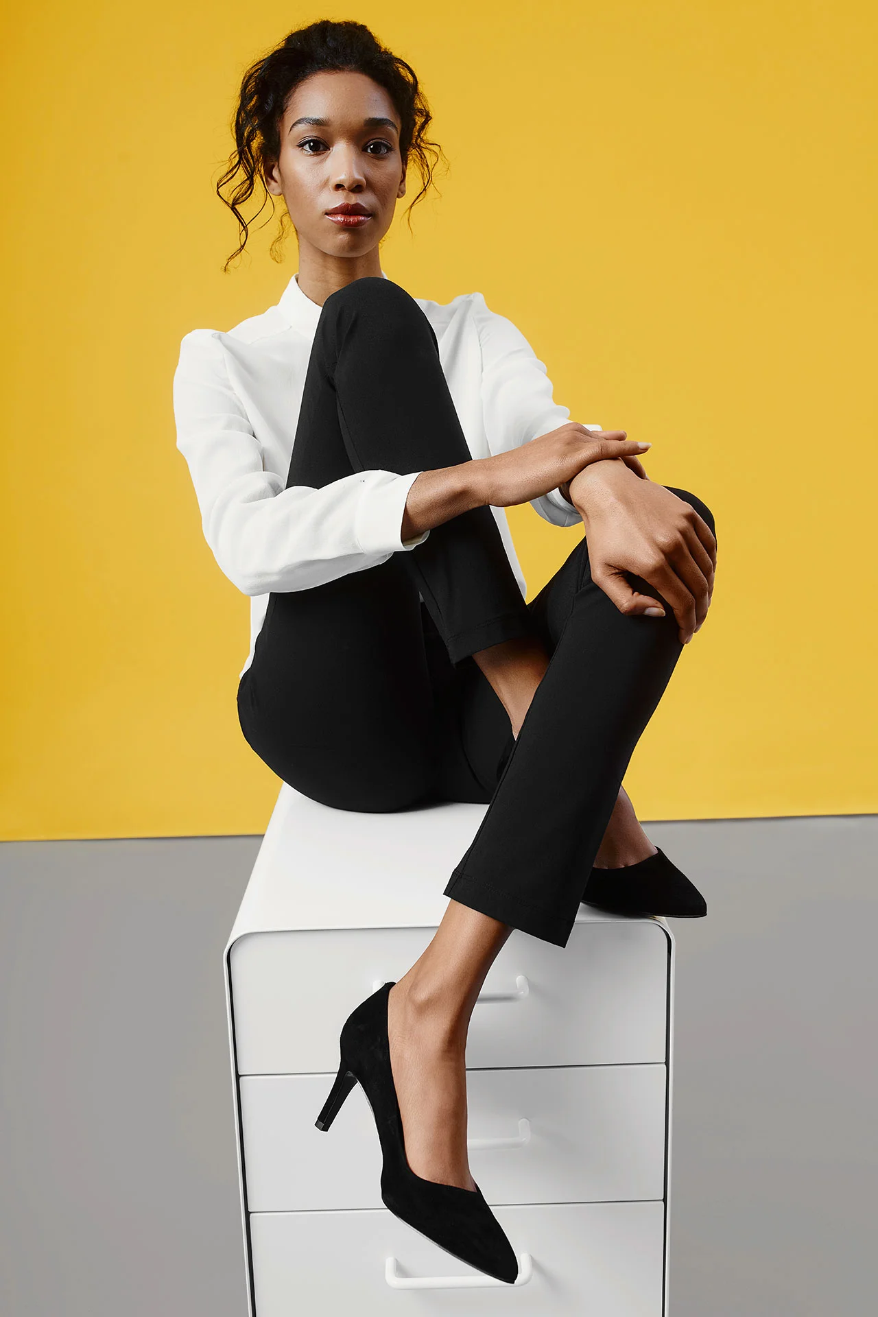
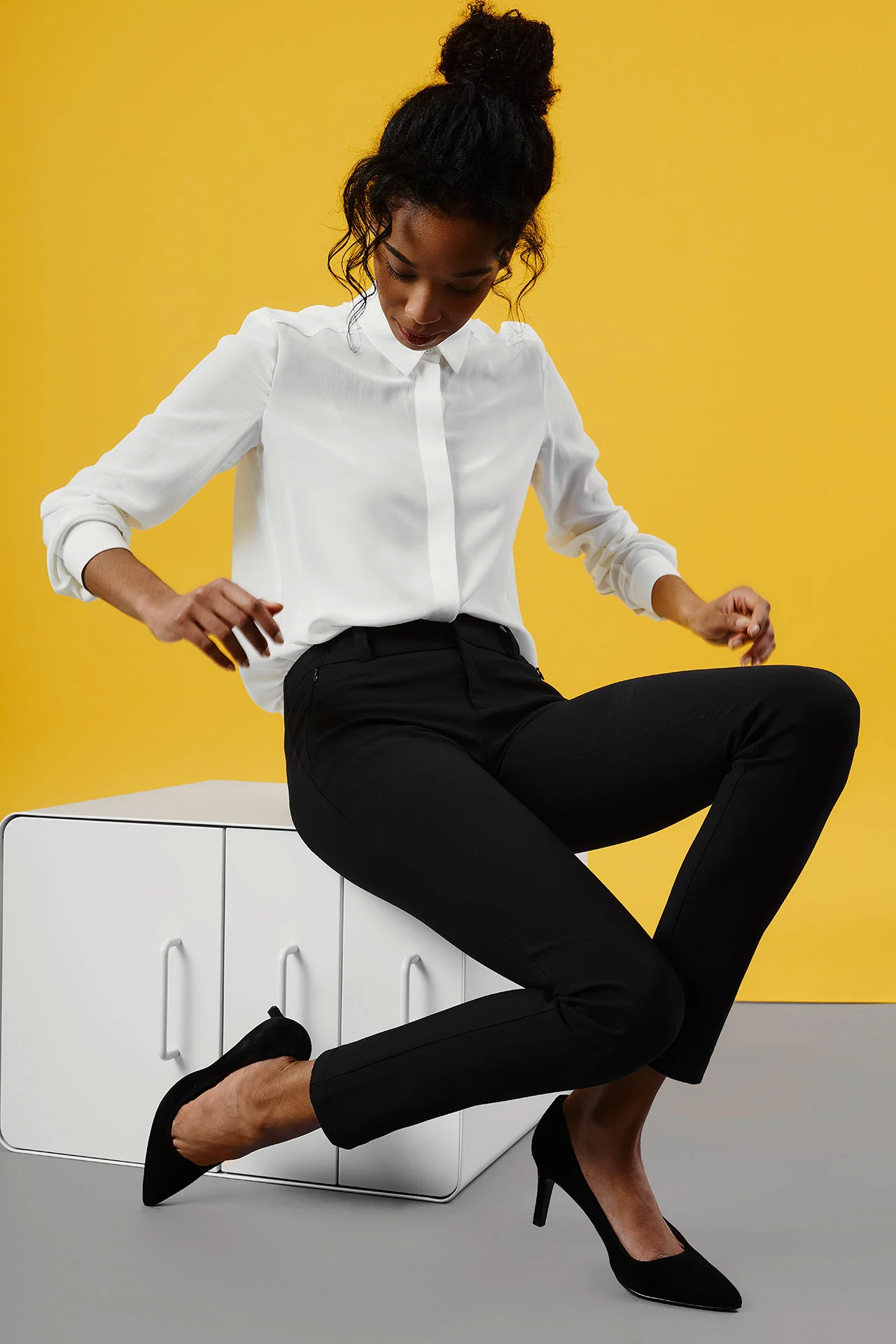
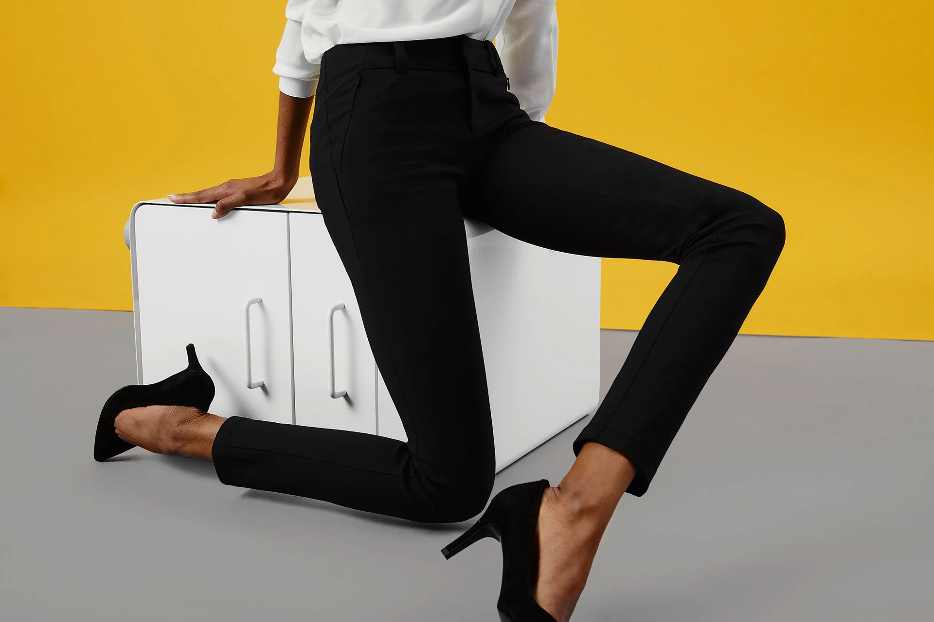
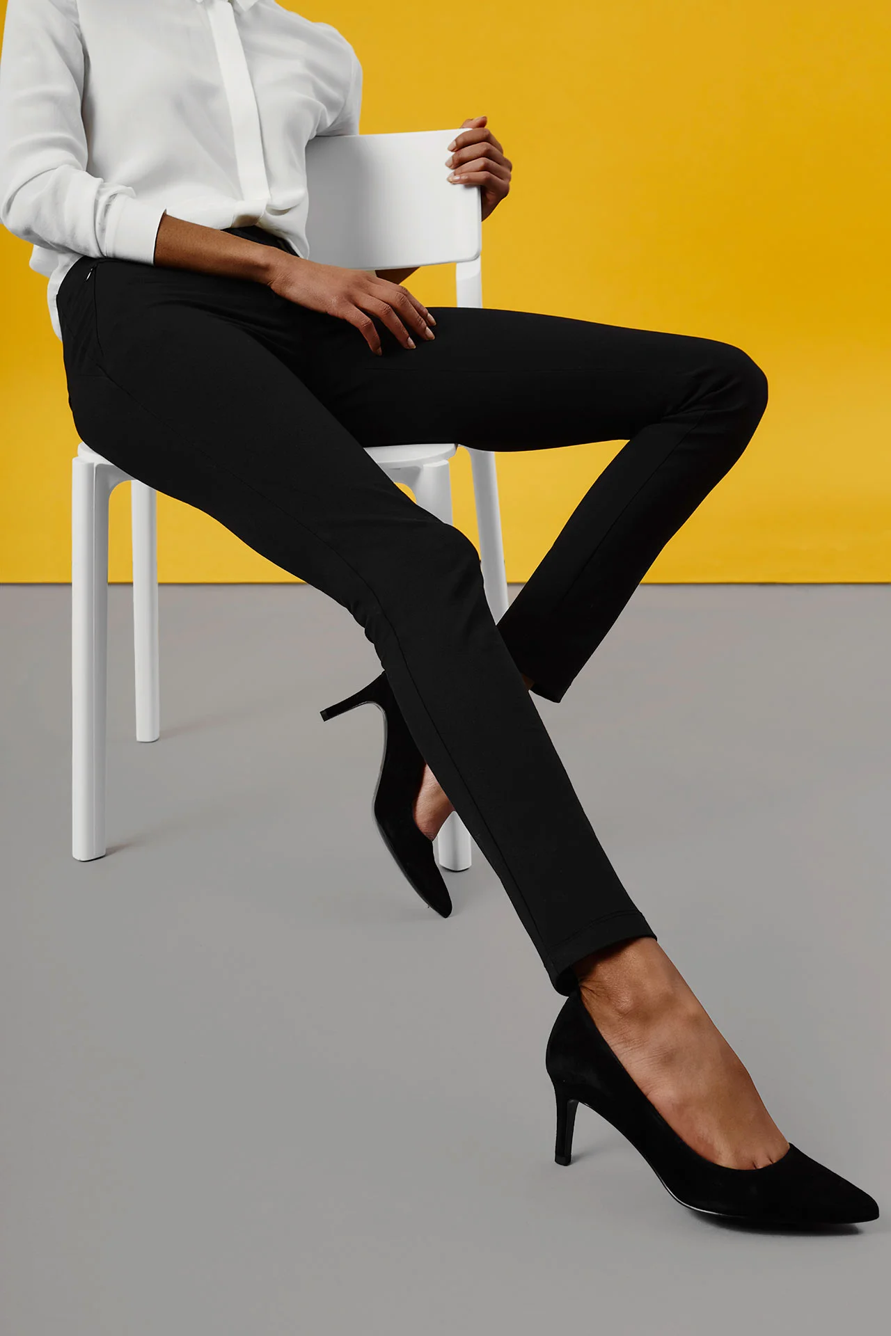
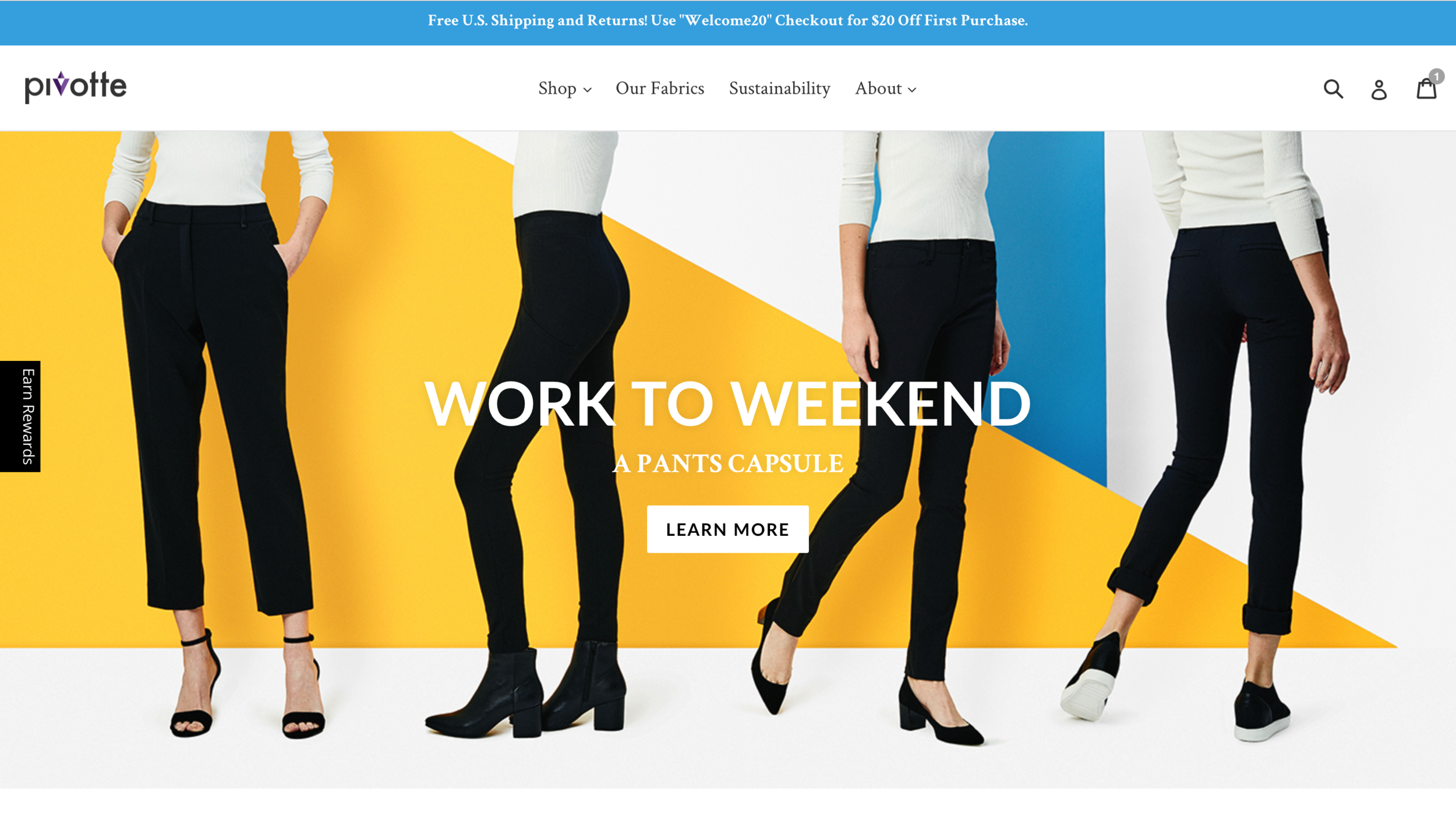
We wanted to make a bold and strong statement with our branding and messaging to give the brand a refresh. Because our colors and silhouettes are very classic and clean, we had a lot of room to play in our campaigns and photoshoot materials. We chose cyber yellow and azure blue as our core campaign colors, with bold black and white graphic elements throughout.
Photography: Robert Bredvad
Art Direction: Yannell Rodriguez
campaign images
website updates
With sales and customer feedback as well as new creative material with bolder visuals, we took a more targeted approach to focus on one product category, bottoms.
Retail Site 2.1
(click to view video below)
User Testing
We went through a couple of rounds of user testing gathering user traffic and shopper habits using both customer survey and web traffic analytics to further refine and increase conversion.
Key findings
We had made assumptions that since we are a new brand, visitors need more introduction before deciding to shop. However, we found this to be not true, with shop and product pages receiving outsized traffic.
We had a 50% drop off scroll rate after approximately 2 folds down, so it was important for us to re-prioritize what was shown first.
Confusion over sub-menu usage.


